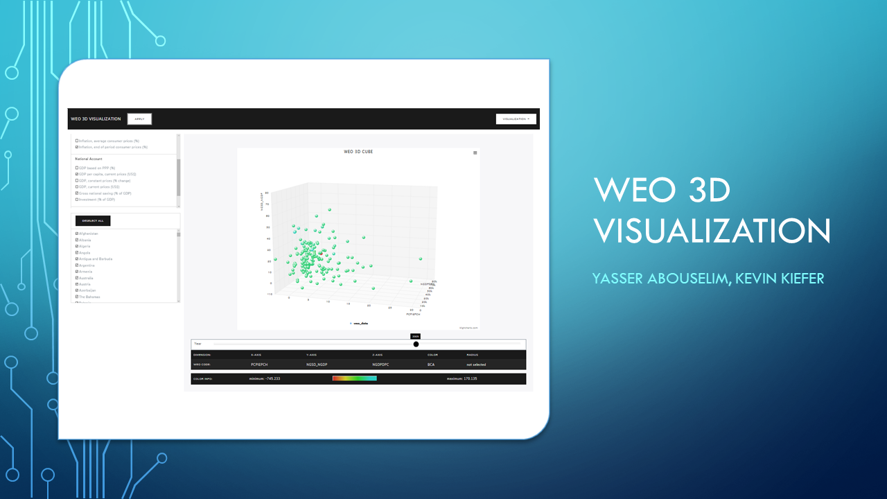
This webpage describes an advanced software practical by Yasser Selim and Kevin Kiefer, supervised by Prof. Dr. Susanne Krömker (Visualization and Numerical Geometry Group, IWR Universität Heidelberg). The aim of this practical was to explore three-dimensional visualizations of the World Econmic Outlook dataset. As part of the practical, we implemented a node.js application that provides said visualizations.
Please note, that the tool and a slideshow of the presentation may be accessed via the "Demo" and "Slideshow" buttons in the top right corner.
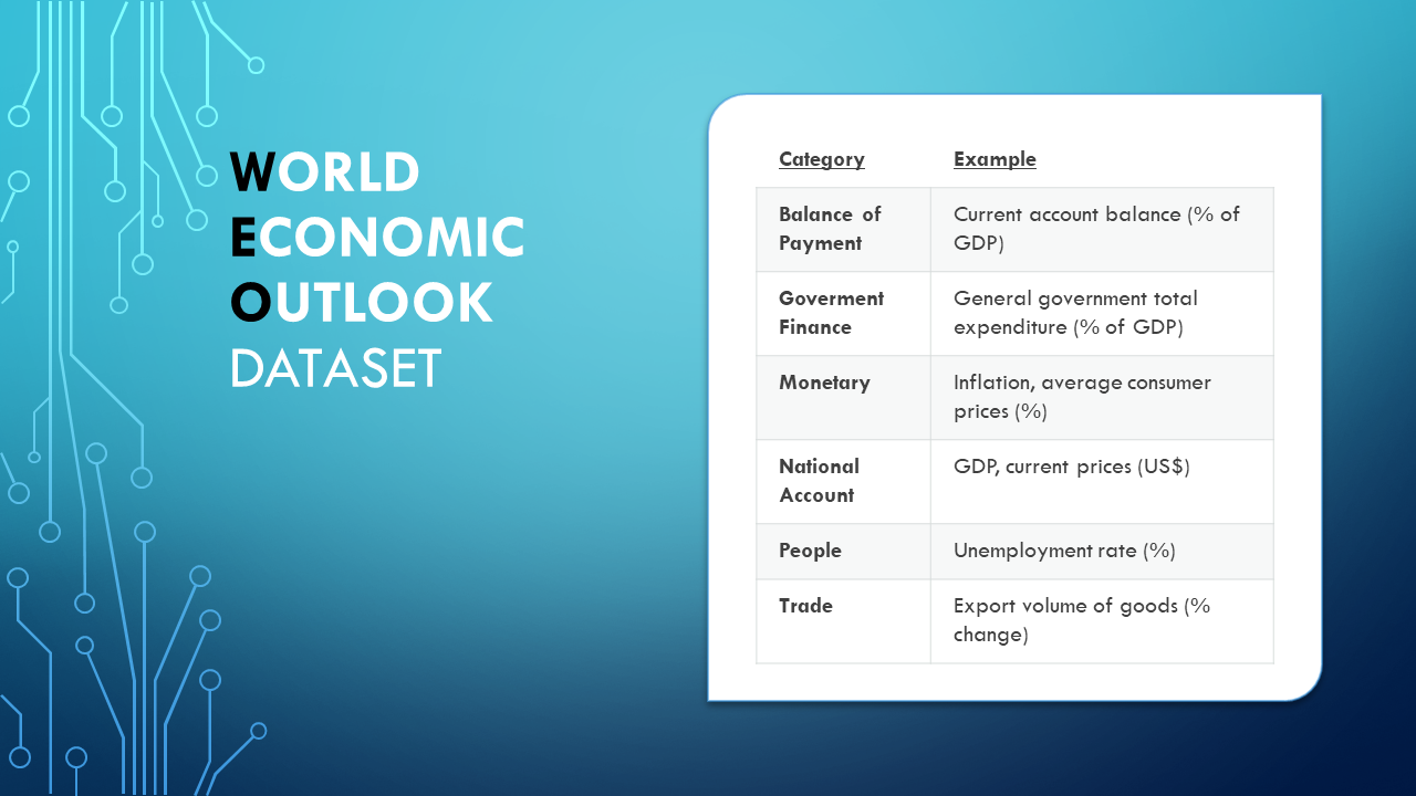
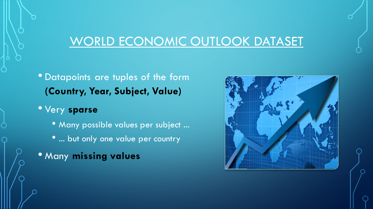
The World Econmic Outlook (WEO) dataset contains selected macroeconomic data from the World Econmic Outlook report. It presents analysis and projections of economic developments at the global level, in major country groups and in many individual countries. Amongst other things, it contains data on national accounts, inflation, unemployment rates, balance of payments, trade, etc. The available data ranges from 1980 to the present. For some countries, however, the data is incomplete or missing in certain years.
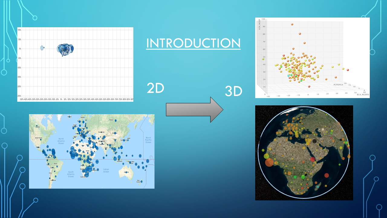
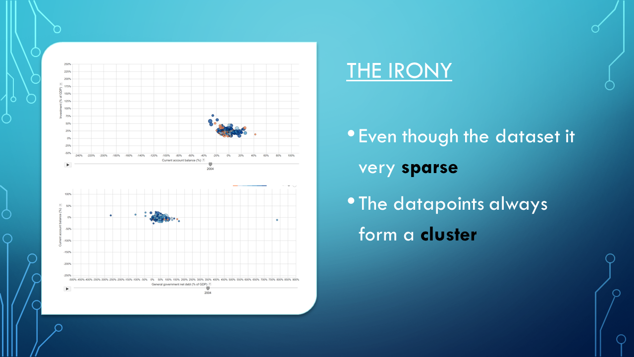
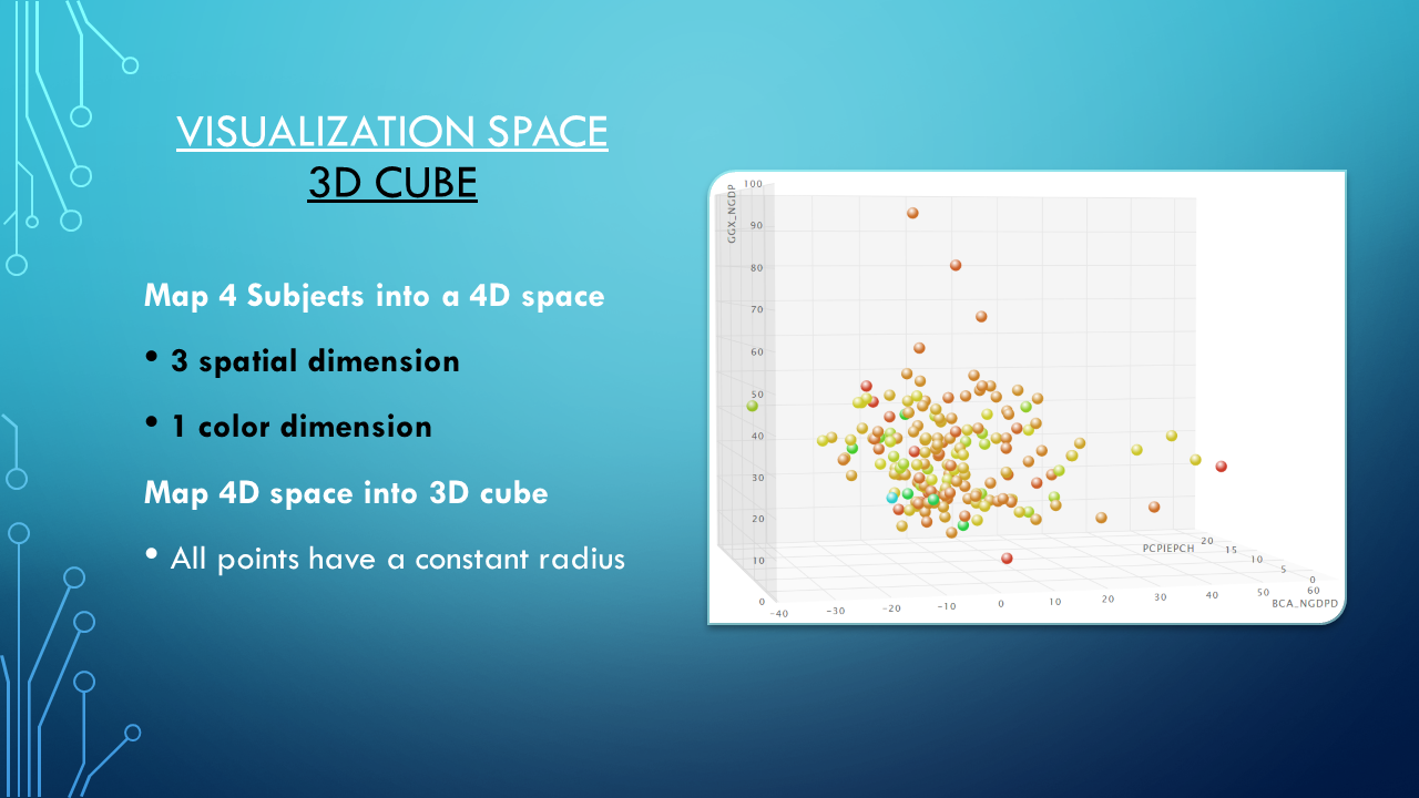
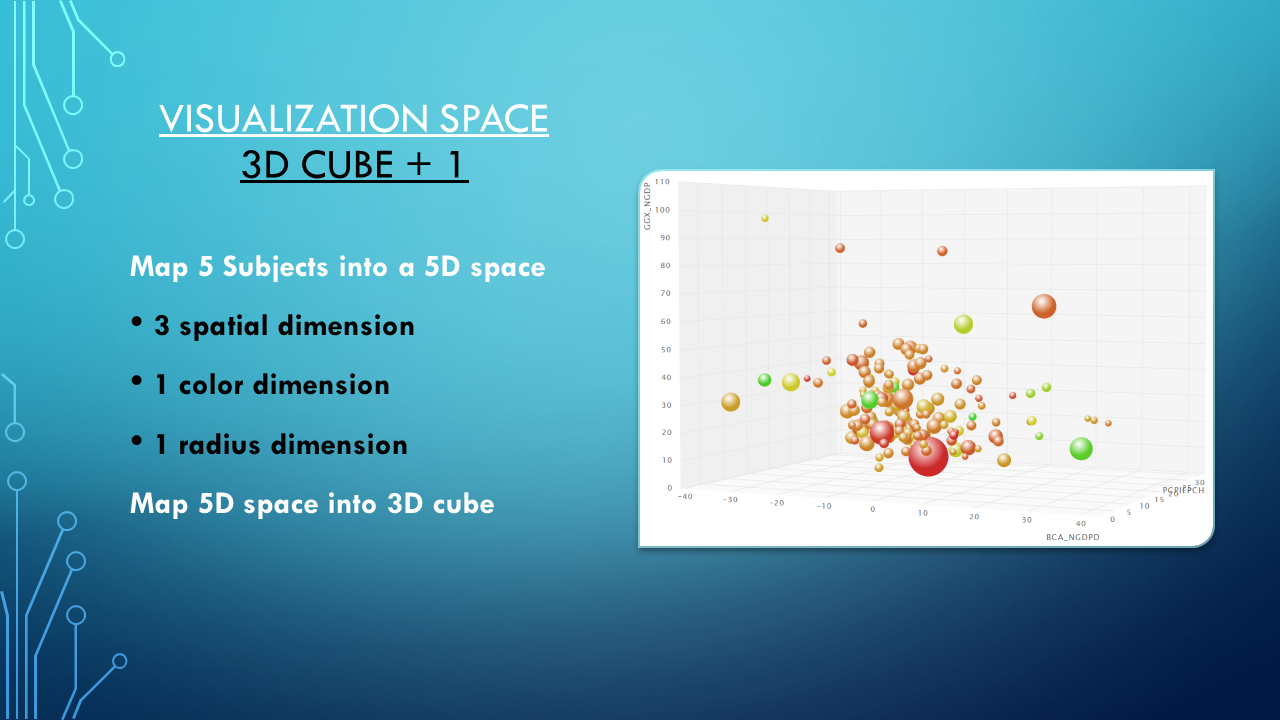
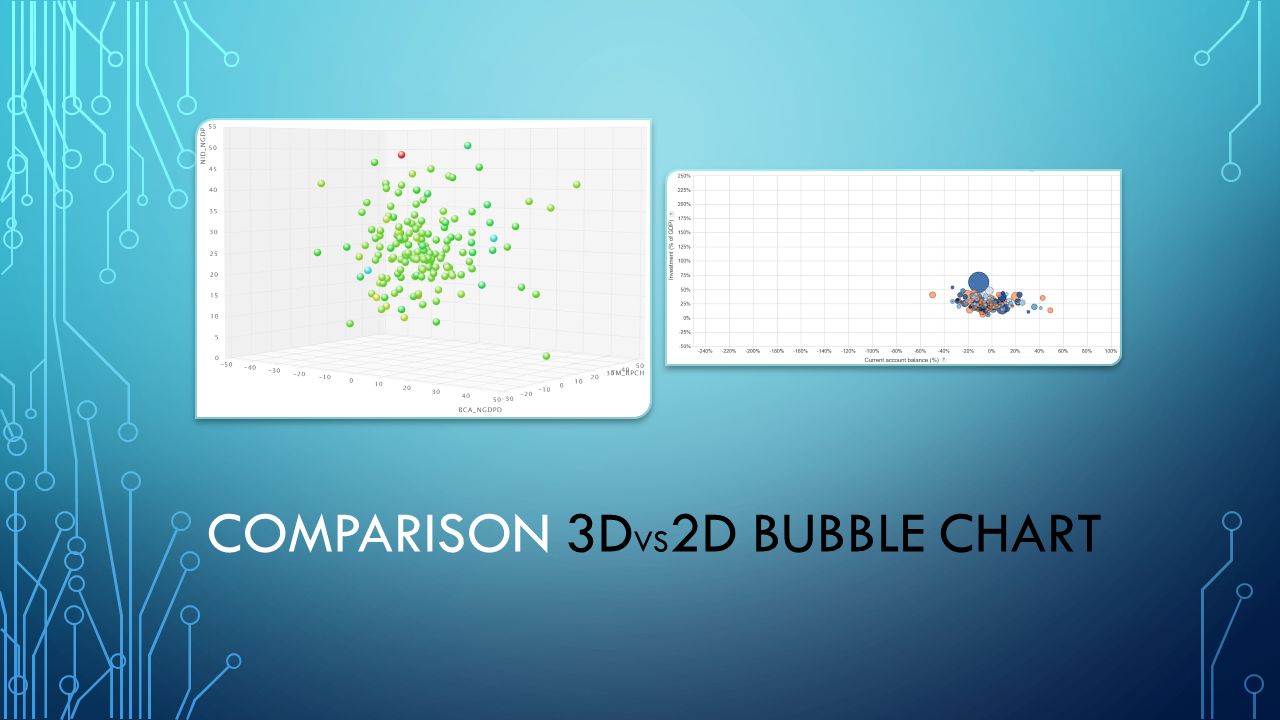
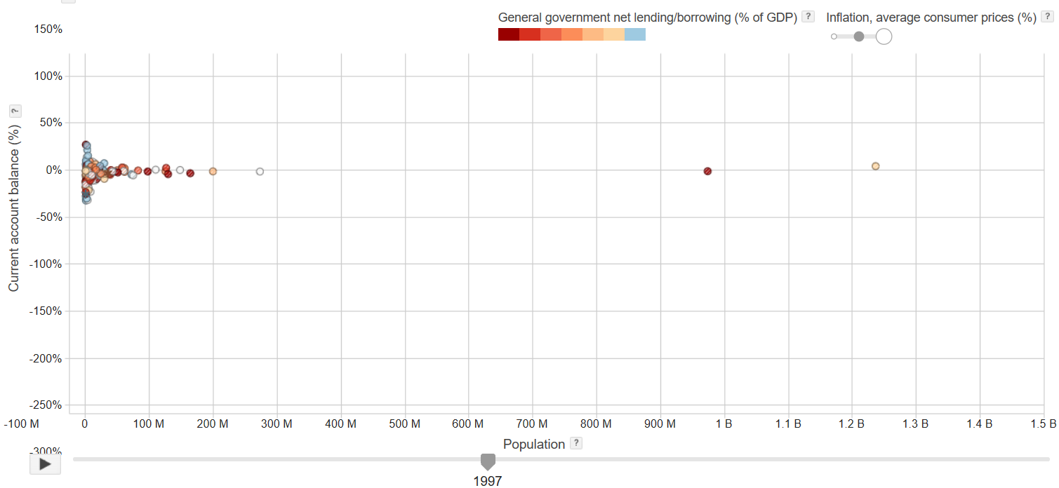
Because the dataset features one datapoint per country, year and subject (e.g. (Germany, 2000, GDP)) and many of the subject domains are large, the dataset is very sparse compared the size of the space the datapoints reside in. Yet the data has a tendency to form clusters for many of the possible 2D visualizations as shown in Figure 1. As a result, certain configurations can not be visualized properly. We solve this by moving to a three-dimensional visualization space. Furthermore, the user is given the option of rotating the box that contains the visualization and, as a result, may choose between different projections of this three-dimensional visualizations on the two-dimensional computer screen.
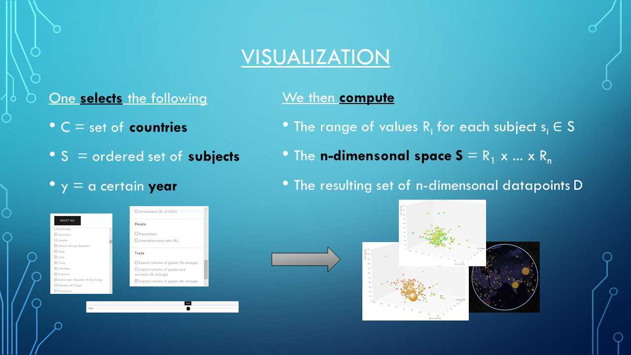
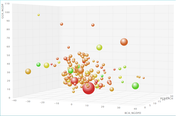
The primary visualization method is a three-dimensional bubble chart as shown in Figure 2. With this method, one may compare four or five different subjects at a time. Depending on the amount of selected subjects, the mapping onto the dimensions of the visualization space is as follows:

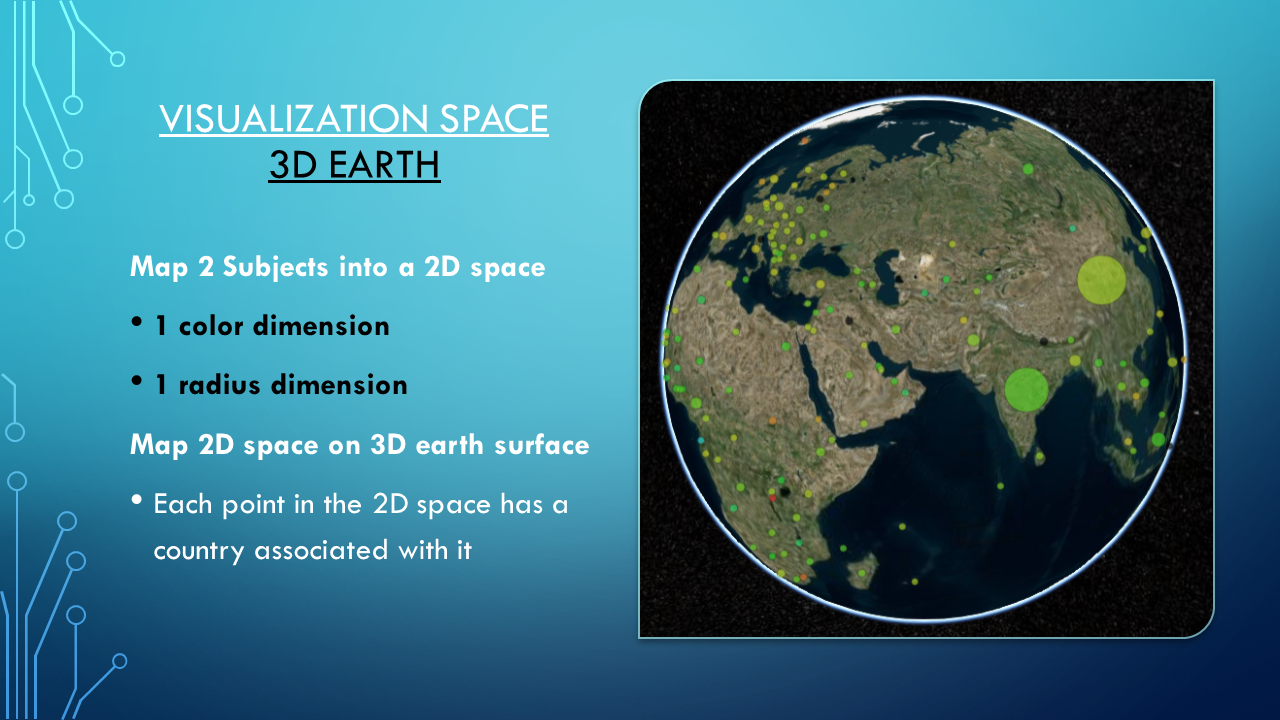
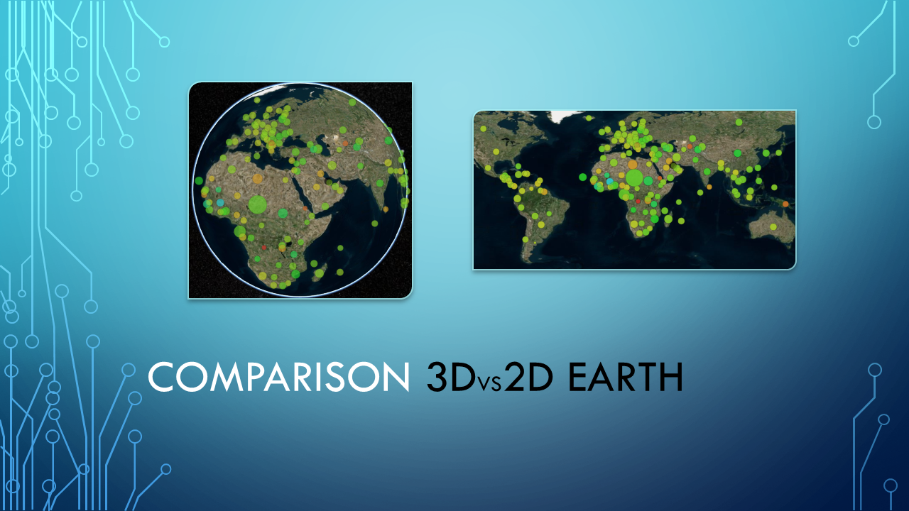
Apart from the bubble chart visualization, we also provide a mapping onto a three-dimensional globe as seen in Figure 3. However, compared to its two dimensional submanifold, this provides little to no advantage for further improving the visualization. Yet, we felt it was necessary to provide a visualization which renders the WEO data within its geospatial context. To this end, we provide a visualization of the the three-dimensional globe as well as it submanifold in combination with several projections on the surface, from simple country borders to detailed street layouts.
For both visualization methods we provide the users the option of choosing their perspective in the sense that they may rotate the visualization to their liking. Ultimately, it is the combination of the additional spatial dimension with the rotation of the viewport which allows the users to find a visual representation of the WEO data that is free of clusters.
We provide a single-page web application which presents the visualizaations to the user.
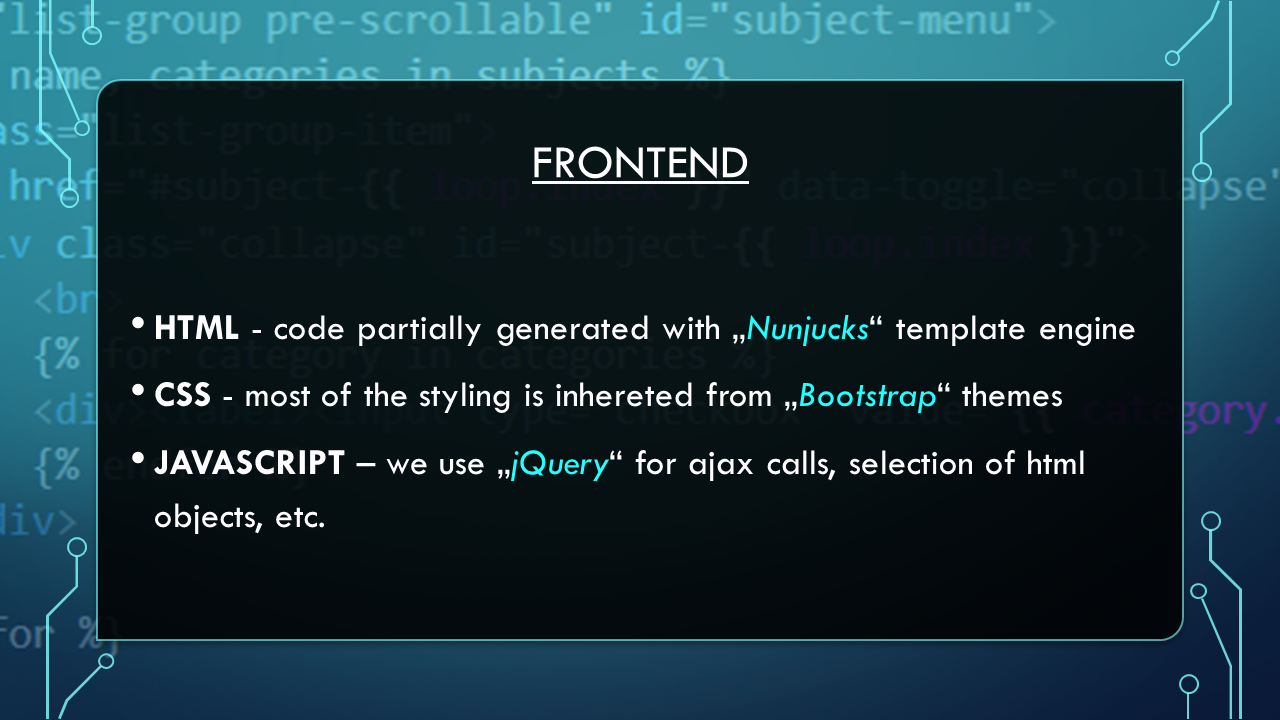
For this, we employ Bootstrap to ensure compatibility with devices of varying display size and employ
JQuery within the JavaScript which updates the content dynamically.
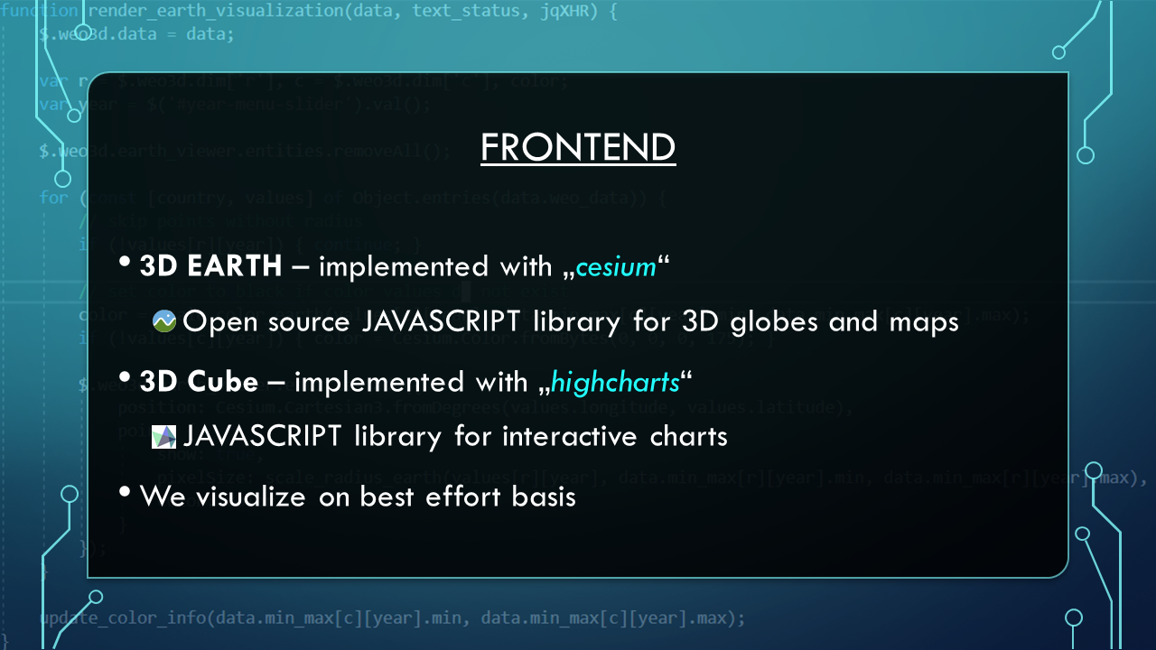
For the visualizations, we make use of Highcharts (see Figure 2) and Cesium (see Figure 3).
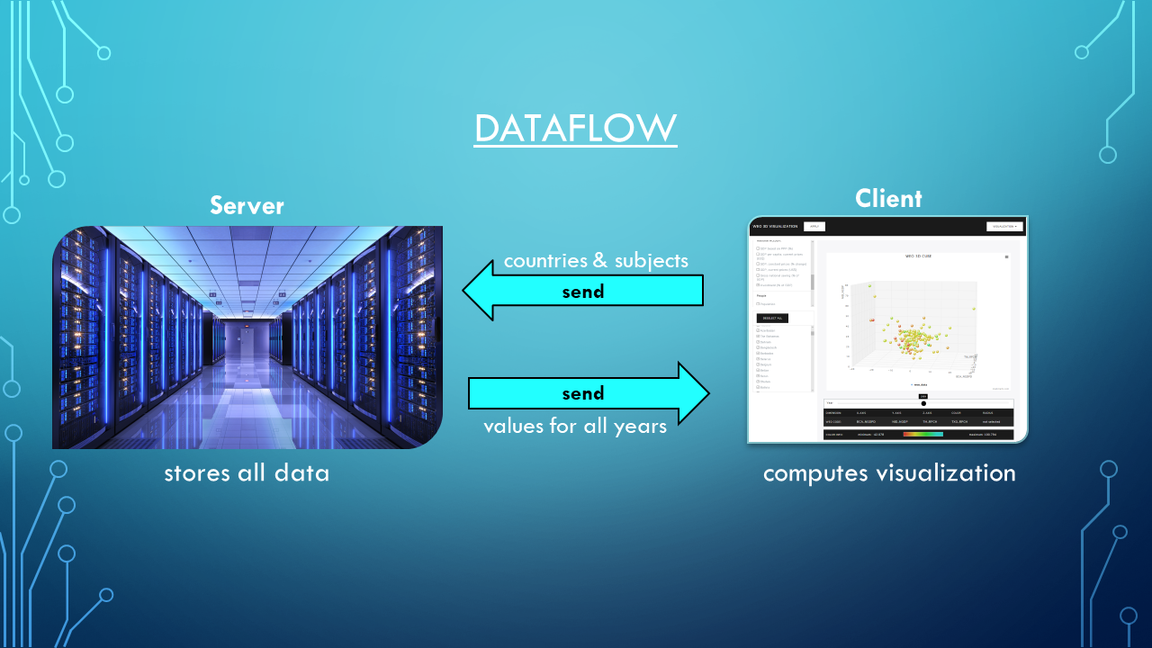
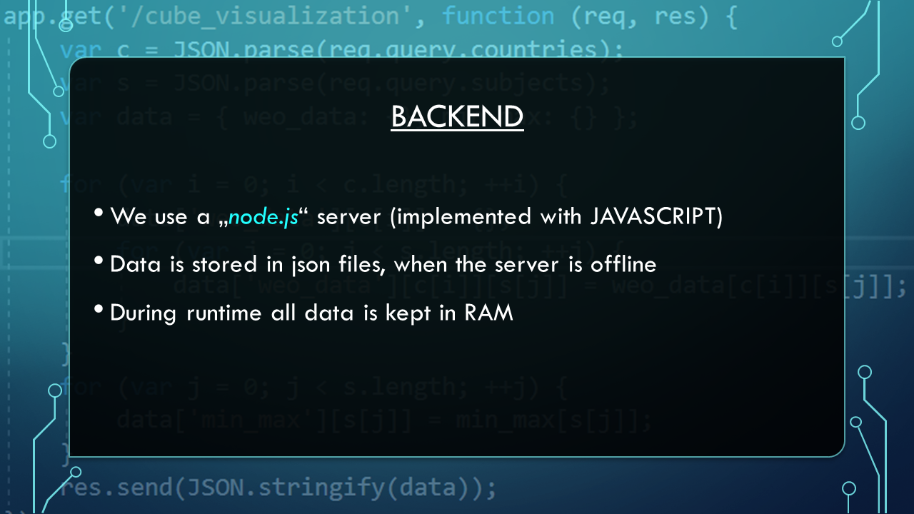
The backend is implemented as a Node.js server which stores and sends the data to the client
as needed. The server uses a Nunjucks templating engine to render the subject and country selection menus.
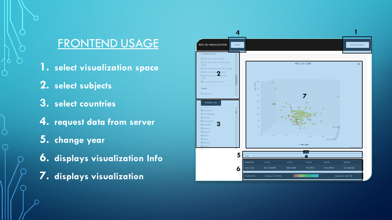
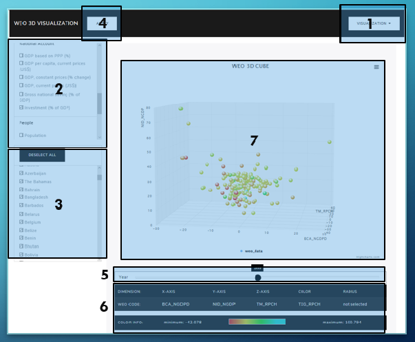
The user interface of the application is depicted in Figure 4 with the important elements enumerated.
These provide the following functionality:
[1] WEO Dataset https://www.imf.org/external/pubs/ft/weo/2014/02/weodata/download.aspx
[2] WEO 2D Visualiations by Google https://www.google.com/publicdata/explore?ds=k3s92bru78li6_#!
[3] WEO 3D Visualiations by us pille.iwr.uni-heidelberg.de/~weodaten01/app
[4] Cesium https://cesiumjs.org/
[5] Highcharts https://www.highcharts.com/
[6] Bootstrap https://getbootstrap.com/
[7] Node.js https://nodejs.org/en/
[8] Nunjucks https://mozilla.github.io/nunjucks/
[9] JQuery https://jquery.com/